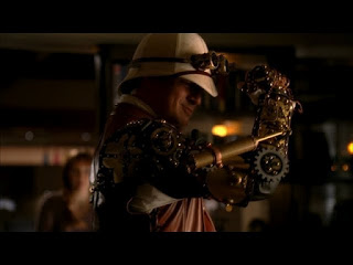
BECKETT: "Steampunk..."
CASTLE: "It's a subculture that embraces the simplicity and romance of the past--at the same time, couples it with the hope and promise and sheer SUPER COOLNESS of futuristic design."
-ABC's "Castle" Season 3, Ep. 4
...Or, put simply by the good ol' urban dictionary, the sub-genre of speculative fiction and fantasy could be summed up by the slogan, "What the past would look like if the future had happened sooner."
For those that still need help, think steam-powered inventions, cogs and aviator goggles. Then look it up, cause it's quite fascinating.

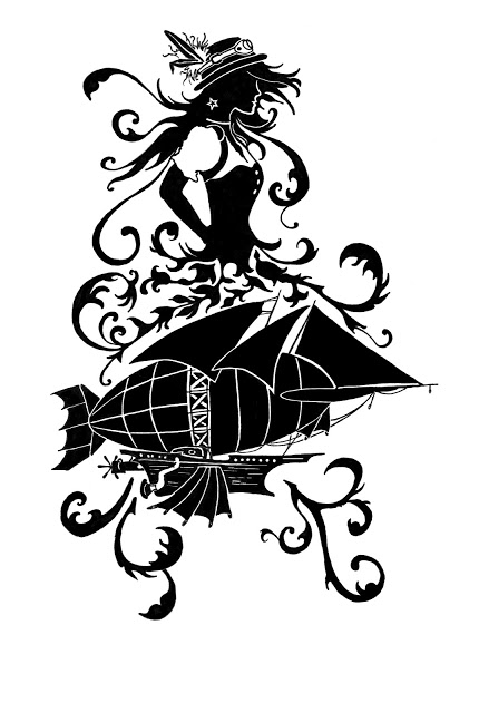
The design concept was to combine a cameo silhouette with appropriate accessories and a steam-powered airship. I started with the ship.
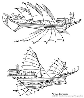 [Concepts: Basic design (above), junk sails (right) and steam powered components (below)]
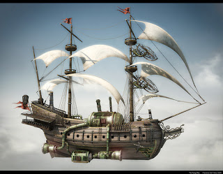


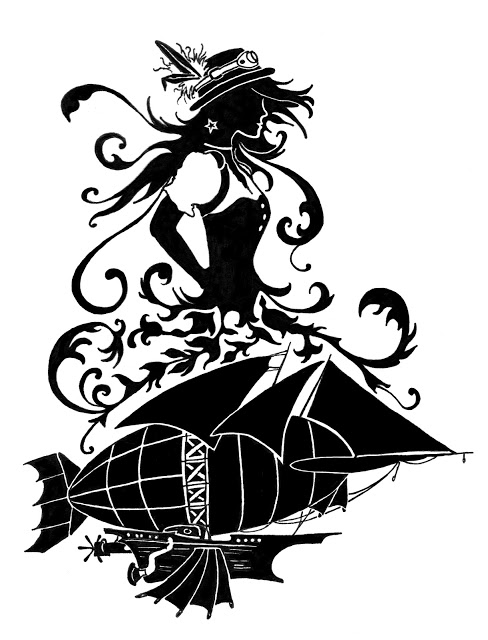
As we filled it in, we realized that it seemed like two separate entities, so we opted for filling in the designs of the ship as well as the sails.
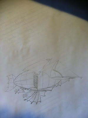
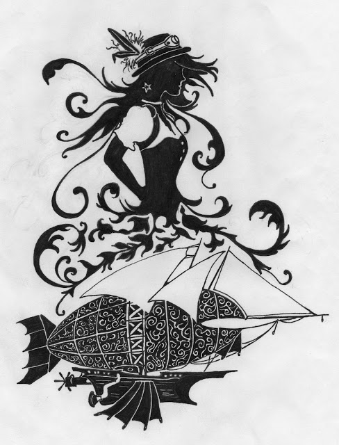
Initial scan, digitally adjusted levels and filled in blacks.
My friend is also fascinated by it and after seeing a doodle of mine on Facebook, I was hired to create a logo based on several images he provided. Enjoy the evolution!
The design concept was to combine a cameo silhouette with appropriate accessories and a steam-powered airship. I started with the ship.
[Concepts: Basic design (above), junk sails (right) and steam powered components (below)]
Preliminary sketch and ink fill-in:
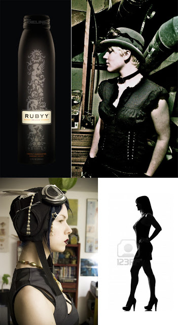
Then came the cameo of the girl -- combining silhouettes, wardrobe and accessories:
Initial sketch/adjustments: move her higher in the design, hat shape, hair, wardrobe, arm.
As we filled it in, we realized that it seemed like two separate entities, so we opted for filling in the designs of the ship as well as the sails.
Initial scan, digitally adjusted levels and filled in blacks.
Added froofy-fluff to tie it all in and Voila!