Every once in a while, a class will surprise me and I'll actually enjoy it :-P This semester's surprise is raster graphics.
For those who are curious, raster graphics are those that are based on a grid, say for instance a photo. Vector graphics are the ones that aren't. An easy way to tell the difference is if you try to enlarge a raster graphic, it gets pixelated. Vector graphics (like company logos on billboards) don't.
This is my 2nd assignment: Create an ad series. We were to combine 3 or more elements to make two 8x10 vertical spreads, and one 16x10 one.
I chose Nalgene :) The concept was heavily inspired by an amazing graphic designer, Luca la Greca. And I have to give a shout-out to my friends for either suggesting people or risking awkward moments to pose for me, even if some didn't make it to the finished product. :-P Thanks to Jessi, Bjorn, Grant, Carmelle, Lori...Oh, and Benge, thanks for the use of the kayak and Matt, thanks for helping me set up lights and throwing water everywhere, haha. You guys absolutely rock :) Let's do it again.
Woohoo, without further ado, here they are! Vote for your fave at the top; humor me, I'm curious :-P [Poll is now closed. Results of the votes in brackets. Thanks for voting!]
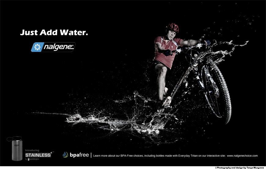
Grant [12 votes, 1st place]
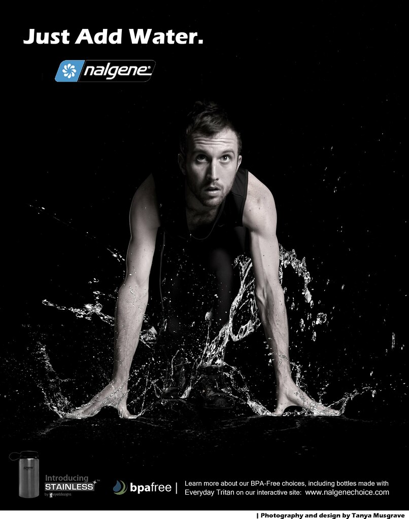
Carmelle [7 votes, 2nd place]
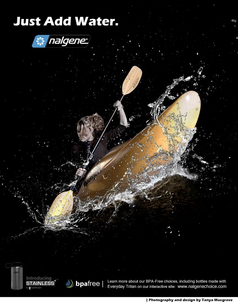
Bjorn [3 votes, 3rd place]
For those who are curious, raster graphics are those that are based on a grid, say for instance a photo. Vector graphics are the ones that aren't. An easy way to tell the difference is if you try to enlarge a raster graphic, it gets pixelated. Vector graphics (like company logos on billboards) don't.
This is my 2nd assignment: Create an ad series. We were to combine 3 or more elements to make two 8x10 vertical spreads, and one 16x10 one.
I chose Nalgene :) The concept was heavily inspired by an amazing graphic designer, Luca la Greca. And I have to give a shout-out to my friends for either suggesting people or risking awkward moments to pose for me, even if some didn't make it to the finished product. :-P Thanks to Jessi, Bjorn, Grant, Carmelle, Lori...Oh, and Benge, thanks for the use of the kayak and Matt, thanks for helping me set up lights and throwing water everywhere, haha. You guys absolutely rock :) Let's do it again.
Woohoo, without further ado, here they are! Vote for your fave at the top; humor me, I'm curious :-P [Poll is now closed. Results of the votes in brackets. Thanks for voting!]
Grant [12 votes, 1st place]
Carmelle [7 votes, 2nd place]
Bjorn [3 votes, 3rd place]